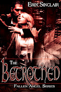
So just to show the progression of a cover, here’s a ‘for example’ of a typical cover assignment.
Viv recently tasked me for a new cover. Her request was this:
Viv recently tasked me for a new cover. Her request was this:
Vision for the cover- Back of a naked woman or naked from waist up, who has long blonde hair. Her hair blowing to the side. Bright sunshine rays. She could be looking at a hot guy in the distance or not. The hair blowing thing would cover the wind.
This was OK, but the fonts are all funky… And Viv didn’t really like the girl…
So, the next version was this one after I had Viv hunt for pictures she thought would fit the story better:

Then we found out that the lovely beach scene photo was $15! Uh, no thanks.
After several attempts at different fonts, and photo filters, we had these:
So, the next version was this one after I had Viv hunt for pictures she thought would fit the story better:

Then we found out that the lovely beach scene photo was $15! Uh, no thanks.
After several attempts at different fonts, and photo filters, we had these:
Completly different beach scene as another option and it was OK, but just not working for Viv.
Then back to the original couple and a new beach scene, but with different fonts:
So, all you authors out there - or even aspiring cover artists, remember that what you might start off with isn’t necessarily what you end up with…
It is a lot of fun to work on covers, it really is. Even with these pesky nitpicky authors. :D
Valerie


4 comments:
Thanks for sharing this V! I love watching you work. :D
I hope I didn't scare anyone off!
:)
Valerie
Oh, and thank you! :)
It's always cool to see how an artist works.
And I love your covers.
Lynn
Post a Comment